Plotting Functions#
Atmospy is a library for making useful, professional figures for atmospheric chemistry and air quality professionals. It is built on top of matplotlib, pandas, and seaborn. Below, we will walk through examples of how to use atmospy and how you can extend it with seaborn and matplotlib.
import atmospy
import pandas as pd
import numpy as np
import seaborn as sns
import matplotlib.pyplot as plt

atmospy.set_theme()
Comparing Data from Multiple Sensors#
Often, we find the need to compare multiple variables against one
another. In the air sensor world, this may be the regression of two
variables against one another or one air sensor against a reference
sensor. Using the atmospy.regplot, we can easily plot the regression
between two variables, fit a linear model, and display the fit
parameters on the figure itself:
df = atmospy.load_dataset("air-sensors-pm")

# plot the Reference measurement vs Sensor A using defaults
atmospy.regplot(df, x="Reference", y="Sensor A");
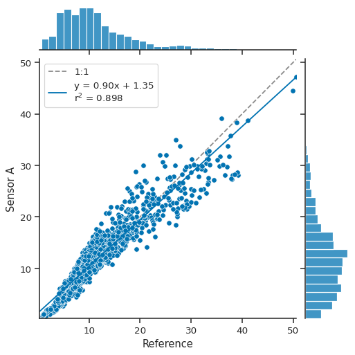
Under the hood, atmospy.regplot is simply making a call to seaborn’s
jointplot function with a few added pieces including adding a unity
line and displaying the fit parameters for the linear model in the
legend.
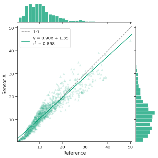
The call returns a seaborn JointGrid which is a group of subplots.
As seen above, the joint axis shows the relationship between the two
variables with a unity line (1:1), the best fit line (shown in solid
blue above), and the distributions for each variables shown on the
marginal axes.
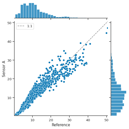
If for some reason, you don’t want to fit a linear model to the data,
you can turn that functionality off by setting fit_reg=False:
atmospy.regplot(df, x="Reference", y="Sensor A", fit_reg=False);
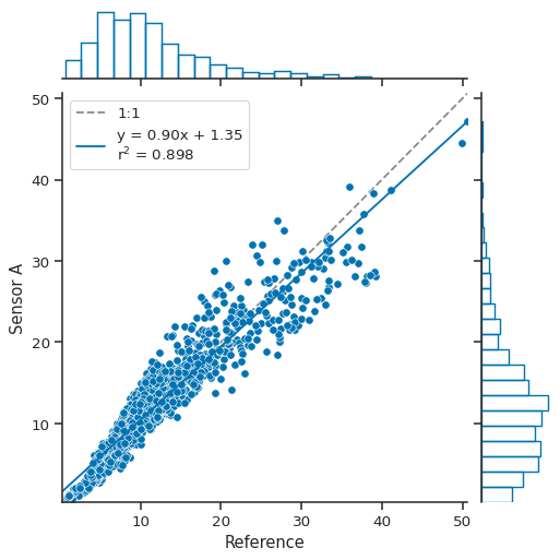
Because we’re just making a call to seaborn’s jointplot function,
you can send along most configuration options as keyword arguments to
atmospy.regplot. For example, if you wanted to change what is shown
on the marginal axes, you can:
atmospy.regplot(
    df, x="Reference", y="Sensor A", marginal_kws={"bins": 25, "fill": False}
);
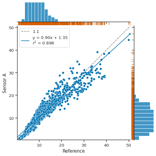
A JointGrid object is returned, which allows you to continue
customizing as you’d like:
g = atmospy.regplot(df, x="Reference", y="Sensor A")
g.plot_marginals(sns.rugplot, color="r", height=-0.15, clip_on=False);
You can easily edit the marker choice, color of marker, or anything else as well:
atmospy.regplot(df, x="Reference", y="Sensor A", color="g", marker="^", alpha=0.15);
Evaluating Trends#
While we often look at timeseries data to visualize trends, it can be
difficult to easily detect trends with large - or long-running -
datasets. Often, it can be easier to look at hourly or daily averages.
The calendarplot function makes it easy to visualize hourly data by
month or daily data by year.
Visualizing hourly data by month#
Some pollutants - such as ozone - have known diurnal patterns due to the photochemical processing of precursor pollutants during the day. Others, such as carbon monoxide and other combustion-related pollutants, may show strong patterns associated with traffic patterns if near a source. Visualizing hourly data can make it easy to identify trends.
ozone = atmospy.load_dataset("us-ozone")

# we only want to use a single site for now
single_site = ozone[ozone["Location UUID"] == ozone["Location UUID"].unique()[0]]
atmospy.calendarplot(
    data=single_site,
    x="Timestamp Local",
    y="Sample Measurement",
    freq="hour",
);
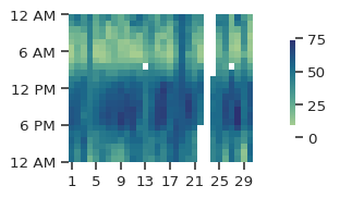
The figure above shows the time of day on the y-axis and the day of month on the x-axis. By looking across the figure from left-to-right, you can quickly see that ozone - for the most part - is higher between 12-6PM than during the early morning. However, the figure above - using the defaults - doesn’t look super appealing, so let’s go ahead and modify it a bit to make it larger, explicitly set the min and max values, and chage to a different color palette:
atmospy.calendarplot(
    data=single_site,
    x="Timestamp Local",
    y="Sample Measurement",
    freq="hour",
    xlabel="Day of Month",
    height=4,
    cmap="flare",
    vmin=0,
    vmax=80,
    title="Ozone in [Month]",
);
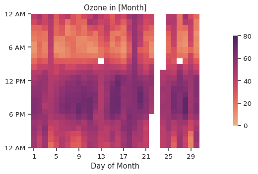
Much better! By default, we aggregate data by the mean value. We can
also change that up to plot by another aggregate, such as the max:
atmospy.calendarplot(
    data=single_site,
    x="Timestamp Local",
    y="Sample Measurement",
    freq="hour",
    xlabel="Day of Month",
    height=4,
    cmap="flare",
    vmin=0,
    vmax=80,
    title="Peak Ozone in [Month]",
    agg="max",
);
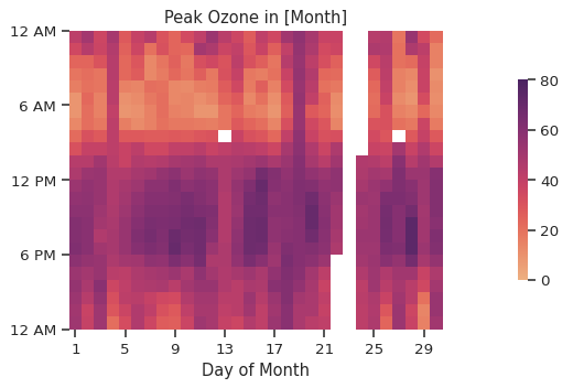
In this instance, there isn’t much of a difference as the data is reported hourly, so the mean and max will be the same (oops). With a more highly time-resolved dataset, this would look a bit different.
Visualizing daily data over the course of a year#
We can also visualize daily data over the course of the year - be default, we plot the daily average for the pollutant of choice:
atmospy.calendarplot(
    data=single_site,
    x="Timestamp Local",
    y="Sample Measurement",
    freq="day",
    cbar=False,
    height=2.5,
    linewidths=0.1,
);
/home/runner/work/atmospy/atmospy/atmospy/trends.py:75: UserWarning: FixedFormatter should only be used together with FixedLocator
  ax.xaxis.set_ticklabels([

You end up with a nice visualization of long-term data that looks a lot like a GitHub contribution graph. It would be even better if we chose a dataset that is complete!
Visualizing data completeness#
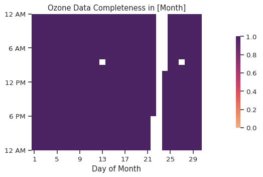
While we mostly plot the trend in pollutant concentration, we can easily
adapt the same figures to plot data completeness by simply switching the
agg argument from mean to count:
atmospy.calendarplot(
    data=single_site,
    x="Timestamp Local",
    y="Sample Measurement",
    freq="hour",
    xlabel="Day of Month",
    height=4,
    cmap="flare",
    vmin=0,
    vmax=1,
    title="Ozone Data Completeness in [Month]",
    agg="count",
);
Visualizing diel trends#
A diel cycle is a pattern that recurs every 24h. Often, we see diel
trends with pollutants that are driven by daytime chemistry such as
ozone or are associated with traffic patterns such as carbon monoxide,
nitrogen oxides, and other combustion tracers. We can easily visualize
the diel trend using the atmospy.dielplot function:
atmospy.dielplot(data=single_site, x="Timestamp Local", y="Sample Measurement")
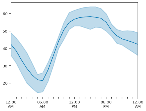
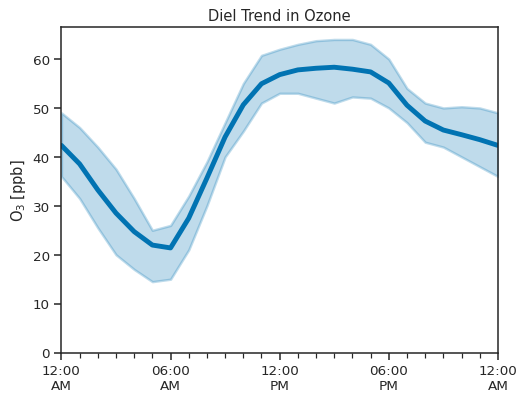
By default, we plot the mean value as a solid line and the interquartile range as the shaded region. We can also customize the figure to adjust the axis, add a title, and otherwise configure the plot via keyword arguments:
atmospy.dielplot(
    data=single_site,
    x="Timestamp Local",
    y="Sample Measurement",
    title="Diel Trend in Ozone",
    ylim=(0, None),
    ylabel="$O_3\;[ppb]$",
    plot_kws={
        "lw": 4,
    },
);
Identifying Sources#
Understanding from which direction a pollutant originated is a common
question in air pollution work. A pollution rose - a variant of the more
common wind rose - is one way to visualize this. A pollution rose is a
polar plot that visualizes the originating direction and intensity of a
specific pollutant. In atmospy, you can use the
atmospy.pollutionroseplot to visualize this:
# load an example dataset with MET info
met = atmospy.load_dataset("air-sensors-met")

atmospy.pollutionroseplot(
    data=met,
    ws="ws",
    wd="wd",
    pollutant="pm25",
    calm=0.0,
);
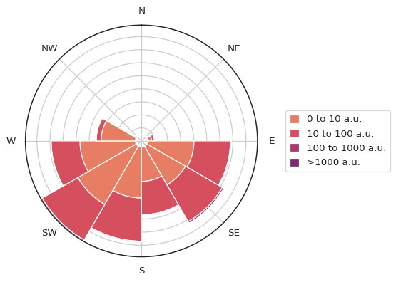
Data for the pollutant of choice are grouped by both the range of
pollutant (as set by bins) and by wind direction (as set by
segments). To ensure that data is not included when the wind speed
is calm (as set by calm), we first remove that data and indicate on
the figure above using the blank center point at the middle of the
figure - we assign calm periods evenly across all directions. In the
figure above, something like a few percent of data records are
registered as calm.
This is important because wind direction data during calm winds isn’t really relevant and/or statistically significant depending on the instrument used to measure the wind speed and wind direction.
In the figure above, the longer the bar, the more data records that are associated with it - in other words, that is the direction from which most data came. The color of a bar indicates the pollutant concentration. In the figure above, most of the PM2.5 is coming from the south-west and south-east. With the pollutant bin sizes set so large, it’s hard to see a pollution differential, so let’s go ahead and modify that:
atmospy.pollutionroseplot(
    data=met,
    ws="ws",
    wd="wd",
    pollutant="pm25",
    bins=[0, 8, 15, 25, 35, 50, 100],
    segments=32,
    calm=0.0,
    suffix="$µgm^{-3}$",
    title="$PM_{2.5}$ by Direction at an Unknown Location",
);
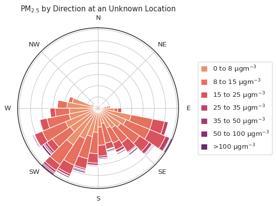
The above figure has quite a bit more resolution along both the theta
and radii as we modified the bins and segments parameters. You
can define bins to be any array-like structure so long as they’re
numeric. pollutionroseplot will always add inf (infinity) at the
end if you didn’t include it so that there is always a catch-all bin for
values higher than the max specified. You can manually define this list
to be whatever resolution or chunkiness you’d like, or, you can create
an evenly-spaced array using NumPy: np.linspace(0, 100, 10).
The segments parameter is a bit different - you define an integer
number of segments to divide the 360 degrees into and the code will
automatically handle it.
Above, we went ahead and showed some of the additional configuration
options that you can include such as the suffix, which labels the
legend, and the title which adds a title to the figure.
Facets and other Fun Things#
Now that you’ve seen how to use the individual plots above, we’re going to go over some of the advanced features that are available by leveraging seaborn’s great grid functionality.
Often, it can be useful to draw multiple versions of the same figure with slight differences in what’s being plotted. For example, you may want to plot a pollution rose, but plot each month of data separately. Or, you may want to plot a diel profile, but show the results for weekdays vs weekends on separate plots so that you can easily see the difference caused by traffic patterns.
To do so, we can use seaborn’s FacetGrid. Seaborn has a great
tutorial on how to use FacetGrid’s
here that we
advise you read. Next, we’ll go over several examples that showcase some
of the cool things you can do with atmospy and seaborn together.
FacetGrid and the pollutionroseplot#
Using the example dataset (air-sensors-met), let’s plot the
pollution rose separetely for each month (the dataset contains data for
April through November). To do so, we will use the FacetGrid
function from seaborn. First, we will add a column that will serve
as the dimension of the figure. In this case, we want to extract the
month:
# load the example dataset
met = atmospy.load_dataset("air-sensors-met")

# add a column that extracts the month from the timestamp_local column
met.loc[:, "Month"] = met["timestamp_local"].dt.month_name()

# print the first 5 records
met.head()
| timestamp_local | wd | ws | pm1 | pm25 | pm10 | temp | rh | Month | |
|---|---|---|---|---|---|---|---|---|---|
| 4 | 2023-05-01 00:00:00 | 229.296667 | 0.862333 | 2.189933 | 2.370022 | 5.517010 | 14.603333 | 53.111667 | May |
| 5 | 2023-05-01 01:00:00 | 233.001667 | 0.911500 | 2.360152 | 2.516538 | 4.623340 | 13.715000 | 54.445000 | May |
| 6 | 2023-05-01 02:00:00 | 230.731667 | 0.930667 | 2.499550 | 2.682507 | 4.816372 | 13.310000 | 58.595000 | May |
| 7 | 2023-05-01 03:00:00 | 218.756667 | 0.892167 | 2.629282 | 2.806970 | 4.851060 | 13.125000 | 59.406667 | May |
| 8 | 2023-05-01 04:00:00 | 206.043333 | 0.791333 | 2.974715 | 3.184287 | 5.859437 | 12.210000 | 62.248333 | May |
As we can see above, we now have a column with the month name. In order
to use the FacetGrid properly, we need to convert our wide-form
dataframe into a long-form dataframe. For a much better explanation of
the difference than I can provide, please read through the seaborn
explanation
here.
We can easily convert our dataframe to long-form by using the Pandas
melt function:
met_long_form = met.melt(
    id_vars=["timestamp_local", "Month", "ws", "wd"], value_vars=["pm25"]
)

# print the first 5 records
met_long_form.head()
| timestamp_local | Month | ws | wd | variable | value | |
|---|---|---|---|---|---|---|
| 0 | 2023-05-01 00:00:00 | May | 0.862333 | 229.296667 | pm25 | 2.370022 |
| 1 | 2023-05-01 01:00:00 | May | 0.911500 | 233.001667 | pm25 | 2.516538 |
| 2 | 2023-05-01 02:00:00 | May | 0.930667 | 230.731667 | pm25 | 2.682507 |
| 3 | 2023-05-01 03:00:00 | May | 0.892167 | 218.756667 | pm25 | 2.806970 |
| 4 | 2023-05-01 04:00:00 | May | 0.791333 | 206.043333 | pm25 | 3.184287 |
Next, we will set up our FacetGrid and tell it to use the Month
column as the dimension and to wrap every 3 so that it all fits into one
nice figure:
# set up the FacetGrid
g = sns.FacetGrid(
    data=met_long_form,
    col="Month",
    col_wrap=3,
    subplot_kws={"projection": "polar"},
    despine=False,
)

# map the dataframe using the pollutionroseplot function
g.map_dataframe(
    atmospy.pollutionroseplot,
    ws="ws",
    wd="wd",
    pollutant="value",
    faceted=True,
    segments=20,
    suffix="$µgm^{-3}$",
)

# add the legend and place it where it looks nice
g.add_legend(
    title="$PM_{2.5}$", bbox_to_anchor=(0.535, 0.2), handlelength=1, handleheight=1
);
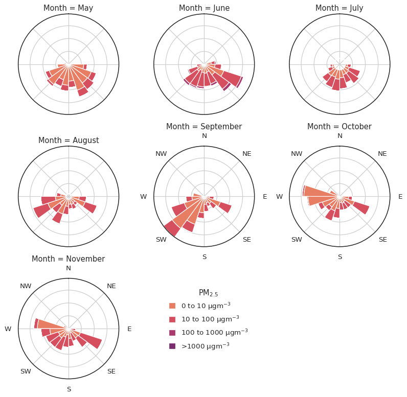
Not bad for 3 lines of code (yes, they are split across more than 3 lines for readability, but still - 3 lines!)!
FacetGrid and the dielplot#
Next, we’re going to go ahead and explore what we can do with the
dielplot on a FacetGrid. Like above, we can simply plot a
slightly different subset of the data in each column - let’s go ahead
and walk through an example. Let’s plot the diel profile for black
carbon on weekdays versus weekends.
First, we need to load our example dataset and modify it a bit to provide the information we want to facet by:
# load the data
bc = atmospy.load_dataset("us-bc")

# select just one random location for now
bc_single_site = bc[bc["Local Site Name"] == bc["Local Site Name"].unique()[0]]

# create a column that sets a bool if the date is a weekend
bc_single_site.loc[:, "Is Weekend"] = (
    bc_single_site["Timestamp Local"].dt.day_name().isin(["Saturday", "Sunday"])
)

# convert to long-form for faceting
bc_long_form = bc_single_site.melt(
    id_vars=["Timestamp Local", "Is Weekend"], value_vars=["Sample Measurement"]
)

# print the first 5 records
bc_long_form.head()
| Timestamp Local | Is Weekend | variable | value | |
|---|---|---|---|---|
| 0 | 2023-01-01 00:00:00 | True | Sample Measurement | 2.76 |
| 1 | 2023-01-01 01:00:00 | True | Sample Measurement | 2.55 |
| 2 | 2023-01-01 02:00:00 | True | Sample Measurement | 3.18 |
| 3 | 2023-01-01 03:00:00 | True | Sample Measurement | 1.64 |
| 4 | 2023-01-01 04:00:00 | True | Sample Measurement | 1.79 |
Now that we have our data prepared, we can set up a FacetGrid like
above and define the column to facet by as the new column we just
created:
g = sns.FacetGrid(
    data=bc_long_form,
    col="Is Weekend",
    # let's adjust the aspect ratio for funsies
    aspect=1.25,
)
g.map_dataframe(atmospy.dielplot, x="Timestamp Local", y="value");
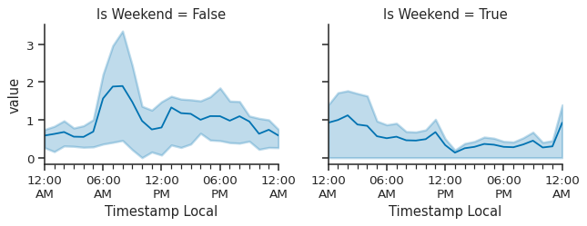
While this isn’t the greatest example, we can see there is difference between weekday’s and weekend’s in the early morning, though the IQR band is quite wide. At some point, we will add some better example datasets so that these figures are more impressive. For now, they work!
Now, what if we had two locations that we wanted to compare? Let’s go ahead and pull data for two sites and show the difference by site rather than by weekday/weekend:
# load the data
bc = atmospy.load_dataset("us-bc")

# select just one random location for now
bc_multi_site = bc[bc["Local Site Name"].isin(bc["Local Site Name"].unique()[0:2])]

# create a column that sets a bool if the date is a weekend
bc_multi_site.loc[:, "Is Weekend"] = (
    bc_multi_site["Timestamp Local"].dt.day_name().isin(["Saturday", "Sunday"])
)

# convert to long-form for faceting
bc_long_form = bc_multi_site.melt(
    id_vars=["Timestamp Local", "Is Weekend", "Local Site Name"],
    value_vars=["Sample Measurement"],
)

# print the first 5 records
bc_long_form.head()
| Timestamp Local | Is Weekend | Local Site Name | variable | value | |
|---|---|---|---|---|---|
| 0 | 2023-01-01 00:00:00 | True | I-25 | Sample Measurement | 2.76 |
| 1 | 2023-01-01 01:00:00 | True | I-25 | Sample Measurement | 2.55 |
| 2 | 2023-01-01 02:00:00 | True | I-25 | Sample Measurement | 3.18 |
| 3 | 2023-01-01 03:00:00 | True | I-25 | Sample Measurement | 1.64 |
| 4 | 2023-01-01 04:00:00 | True | I-25 | Sample Measurement | 1.79 |
Let’s set up the FacetGrid and plot the diel trend by location:
g = sns.FacetGrid(
    bc_long_form,
    row="Local Site Name",
    hue="Local Site Name",
    aspect=1.25,
)

g.map_dataframe(atmospy.dielplot, x="Timestamp Local", y="value")

# update the y-axis limit to force to zero
g.set(ylim=(0, None));
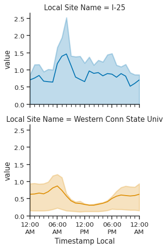
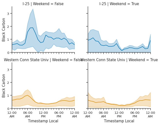
Rather than plotting on the column, we plotted different locations on the row, which sets up the next figure nicely - let’s go ahead and use the same data set, but plot by weekday/weekend AND two different locations together:
g = sns.FacetGrid(
    bc_long_form,
    row="Local Site Name",
    col="Is Weekend",
    hue="Local Site Name",
    aspect=1.25,
)

g.map_dataframe(atmospy.dielplot, x="Timestamp Local", y="value")

# update the y-axis limit to force to zero
g.set(ylim=(0, None), ylabel="Black Carbon")

# update the titles to take up less space
g.set_titles("{row_name} | Weekend = {col_name}");
FacetGrid and the calendarplot#
To complete our introduction to faceting atmospy, we will go over
the calendarplot function. We don’t advise faceting by unique
sensors or location - those would likely be better off as individual
figures. However, since both variants of the plot (e.g., by month or by
year) only plot a single unit of time, we can facet on this. In other
words, we can plot multiple months at a time and view the
hourly-averaged data. Let’s take ozone as an example:
ozone = atmospy.load_dataset("us-ozone")

# we only want to use a single site for now
single_site = ozone[ozone["Location UUID"] == ozone["Location UUID"].unique()[0]]

# add the month name to facet on
single_site.loc[:, "Month"] = single_site["Timestamp Local"].dt.month_name()

# set up the facetgrid
g = sns.FacetGrid(data=single_site, col="Month", col_wrap=3, height=4)

# map the dataframe to the grid
g.map_dataframe(
    atmospy.calendarplot,
    x="Timestamp Local",
    y="Sample Measurement",
    freq="hour",
    cmap="YlGn",
    units="ppb",
    linewidths=0.1,
    cbar=False,
    faceted=True,
)

# update the labels
g.set(xlabel="Day of Month", ylabel="Time of Day");

For now, we will avoid showing the yearly plot in a faceted manner while we work on finding a suitable dataset.