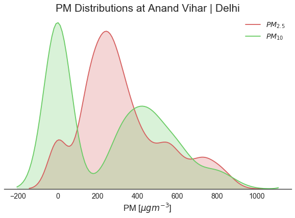
Comparing PM2.5 vs PM10 Concentrations at a site in Delhi
Python source code: [download source: pm25_vs_pm10_distribution.py]
import matplotlib.pyplot as plt
import seaborn as sns
import openaq

sns.set(style="white", palette='muted', font_scale=1.35, color_codes=True)

api = openaq.OpenAQ()

# grab the data
res = api.measurements(city='Delhi', location='Anand Vihar', parameter=['pm25', 'pm10'],
            limit=10000, df=True)

# clean up the data by removing values below 0
res = res.query("value >= 0.0")

# seperate the data into pm25 and pm10 dataframes
pm25 = res.query("parameter == 'pm25'")
pm10 = res.query("parameter == 'pm10'")

# set up the axis
fig, ax = plt.subplots(1, figsize=(8, 6))

# plot the pm25 and pm10 distributions
ax = sns.distplot(pm25['value'].values, color='r', hist=False, kde_kws={'shade': True}, label='$PM_{2.5}$', ax=ax)
ax = sns.distplot(pm10['value'].values, color='g', hist=False, kde_kws={'shade': True}, label='$PM_{10}$', ax=ax)

# Set the labels
ax.set_xlabel("PM [$\mu g m^{-3}$]", fontsize=16)
ax.set_title("PM Distributions at Anand Vihar | Delhi", fontsize=20)

# despine the plot
sns.despine(left=True)

# Remove the yticks
ax.set(yticks=[])