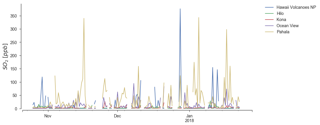
Hawai’i SO2 Timeseries
Python source code: [download source: hawaii_ts_plot.py]
import matplotlib.pyplot as plt
import seaborn as sns
import openaq

sns.set(style="ticks", font_scale=1.35)

api = openaq.OpenAQ()

# grab the data
res = api.measurements(city='Hilo', parameter='so2', limit=10000, df=True)

fig, ax = plt.subplots(1, figsize=(12, 6))

for group, df in res.groupby('location'):
    _df = df.query("value >= 0.0").resample('12h').mean()

    # Convert from ppm to ppb
    _df['value'] *= 1e3

    # Plot the data
    _df.value.plot(ax=ax, label=group)

ax.legend(loc='best')
ax.set_ylim(0, None)
ax.set_ylabel("$SO_2 \; [ppb]$", fontsize=18)
ax.set_xlabel("")

# move the legend to the side
plt.legend(bbox_to_anchor=(1.05, 1), loc=2, borderaxespad=0.)

sns.despine(offset=5)